NamedControl
Overview
Controls added to the Intelligent Module UI and their underlying DSP parameters can be accessed from the script using the NamedControl interface.
The extensive remote-control system in Composer can then be used to link any named controls in the Intelligent Module UI to any other controls in the system using Remote Control Numbers.
NamedControl.
| Return Type | Return Range | Comment | |
| NamedControl.GetText(name) | String | String | Gets the Text of the Named Control |
| NamedControl.SetText(name, value) | Function | Sets the Text of the Named Control | |
| NamedControl.GetValue(name) | Float | User adjustable range | Gets the Value of the Named Control |
| NamedControl.SetValue(name, value) | Function | Sets the Value of the Named Control | |
| NamedControl.GetPosition(name) | Float | 0-1 | Gets the Position of the Named Control |
| NamedControl.SetPosition(name, position) | Function | 0-1 | Sets the Position of the Named Control |
The API uses an editable control “name” as an argument for each function. The names correspond to the editable property “Control Name” for each control.
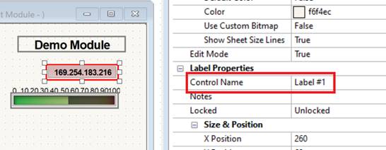
Take care not to reuse Control Names. The script will choose the first placed control if there are multiple with the same name. The default names for controls will be unique although copying and pasting a control will result in duplicate names.
For more about these control properties, see Intelligent Module Control View Layout.
The NamedControl API works differently for each control type. Control types are described in detail here.
NamedControl.GetText(name)
Returns a String of the Text displayed on the control with the provided name.
Print(NamedControl.GetText("myLabel")) >> Ben
This works for the following control types:
| Control | Function |
| Label | Get Label text |
| Numeric | Get Numeric display text with unit and rounding |
| Fader | Get Fader value as text including with unit and rounding |
| Button | n/a |
| Radio Button | n/a |
| LED | n/a |
| Multistate LED | n/a |
| Meter | n/a |
| Gauge | n/a |
| Drop List | n/a |
| Video Stream | Get the URL for the image being shown |
NamedControl.SetText(name, value)
Sets the Text displayed on the control with the provided name, using the provided text.
NamedControl.SetText("myLabel", "Ben")) -- Set Label to Ben
This works for the following control types:
| Control | Function |
| Label | Set Label text |
| Numeric | n/a |
| Fader | n/a |
| Button | n/a |
| Radio Button | n/a |
| LED | n/a |
| Multistate LED | n/a |
| Meter | n/a |
| Gauge | n/a |
| Drop List | n/a |
| Video Stream | Set the URL for the image to show |
Remember that for Labels and Video Stream, you will use the .SetText function, while for all others control types, you will use .SetValue or .SetPosition described below.
All controls can have their text set to a static value using the Properties panel.
NamedControl.GetValue(name)
Returns a Float of the Value of the control with the provided name.
Print(NamedControl.GetValue("myFader")) >> 40
The float value returned is within the range specified by the Minimum and Maximum items in the Properties panel for the control. Minimum refers to the value at minimum control position; similarly, Maximum is the value at the maximum control position. The values can be inverted if its desired to have the control operate backward. The distribution between these limits will use the Taper property.
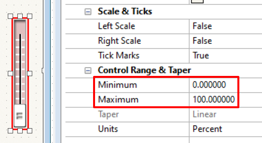
This works for the following control types:
| Control | Function |
|---|---|
| Label | n/a |
| Numeric | Get value of Numeric, Range and taper are user configurable in control properties. |
| Fader | Get value of Fader, Range and taper are user configurable in control properties. |
| Button | Get value of Button, 0 for disabled, 1 for enabled |
| Radio Button | Get value of selected Radio Button, Value is 0 indexed Float of the selected Button, (e.g. 7.0 for the 8th Button in the group), See Example 5 below. |
| LED | Get value of LED, 0 for disabled, 1 for enabled |
| Multistate LED | Get value of Multi State LED, Value is evenly distributed between 0 and 1 based on the LED states |
| Meter | Get value of Meter, Range and taper are user configurable in control properties. |
| Gauge | Get value of Gauge, Range and taper are user configurable in control properties. |
| Drop List | Get value of selected Drop List item, Value is 0 indexed Float of the selected item, (e.g. 7.0 for the 8th item in the Drop List) |
| Video Stream | n/a |
NamedControl.SetValue(name, value)
Sets the Value of the control with the provided name, to the specified value.
NamedControl.SetValue("myFader", 50) >> Fader value set to 50
The float value returned is within the range specified by the Minimum and Maximum items in the Properties panel for the control. Minimum refers to the value at minimum control position; similarly, Maximum is the value at the maximum control position. The values can be inverted if its desired to have the control operate backward. The distribution between these limits will use the Taper property.
This works for the following control types:
| Control | Function |
|---|---|
| Label | n/a |
| Numeric | Set value of Numeric, Range and taper are user configurable in control properties. |
| Fader | Set value of Fader, Range and taper are user configurable in control properties. |
| Button | Set value of Button, 0 for disabled, 1 for enabled |
| Radio Button | Set value of selected Radio Button, Value is 0 indexed Float of the selected Button, (e.g. 7.0 for the 8th button in the group) |
| LED | Set value of LED, 0 for disabled, 1 for enabled |
| Multistate LED | Set value of Multi State LED, Value is evenly distributed between 0 and 1 based on the LED states |
| Meter | Set value of Meter, Range and taper are user configurable in control properties. |
| Gauge | Set value of Gauge, Range and taper are user configurable in control properties. |
| Drop List | Set value of selected Drop List item, Value is 0 indexed Float of the selected item, (e.g. 7.0 for the 8th item in the Drop List) |
| Video Stream | n/a |
Remember that while most controls use the .SetValue function, you will instead use .SetText for labels and Video Stream controls as described below above.
NamedControl.GetPosition(name)
Returns a Float of the Position of the control with the provided name.
Print(NamedControl.GetPosition("myFader")) >> 0.4
The Position is similar to Value but it is always between 0-1 and is independent of the Taper. Put another way, Value is affected by the Control Range and Taper, while Position is not.
This works for the following control types:
| Control | Function |
|---|---|
| Label | n/a |
| Numeric | Get position of Numeric, Range is linearly spread between 0 and 1. |
| Fader | Get position of Fader, Range is linearly spread between 0 and 1. |
| Button | Get position of Button, 0 for disabled, 1 for enabled |
| Radio Button | Get position of selected Radio Button, Position is evenly distributed between 0 and 1 based on the Radio Buttons |
| LED | Get position of LED, 0 for disabled, 1 for enabled |
| Multistate LED | Get position of Multi State LED, Position is evenly distributed between 0 and 1 based on the LED states |
| Meter | Get position of Meter, Range and taper are user configurable in control properties. |
| Gauge | Get position of Gauge, Range and taper are user configurable in control properties. |
| Drop List | Get position of selected Drop List item, Position is evenly distributed between 0 and 1 based on the Drop List items. |
| Video Stream | n/a |
NamedControl.SetPosition(name, position)
Sets the Position of the control with the provided name, to the specified value.
NamedControl.SetPosition("myFader", .5) >> Fader position set to .5
Again, the Position is similar to Value but it is always between 0-1 and is independent of the Taper. Put another way, Value is affected by the Control Range and Taper, while Position is not.
This works for the following control types:
| Control | Function |
|---|---|
| Label | n/a |
| Numeric | Set position of Numeric, Range is linearly spread between 0 and 1. |
| Fader | Set position of Fader, Range is linearly spread between 0 and 1. |
| Button | Set position of Button, 0 for disabled, 1 for enabled |
| Radio Button | Set position of selected Radio Button, Position is evenly distributed between 0 and 1 based on the Radio Buttons |
| LED | Set position of LED, 0 for disabled, 1 for enabled |
| Multistate LED | Set position of Multi State LED, Position is evenly distributed between 0 and 1 based on the LED states |
| Meter | Set position of Meter, Range and taper are user configurable in control properties. |
| Gauge | Set position of Gauge, Range and taper are user configurable in control properties. |
| Drop List | Set position of selected Drop List item, Position is evenly distributed between 0 and 1 based on the Drop List items. |
| Video Stream | n/a |
Usage Examples
The following examples illustrate how these can be used:
Example 1 - General Usage with Polling
A common way to use named controls is to poll them using a timer. Every TimerClick period, the values of the inputs are read, some processing is performed, and the user interface is updated. This takes the form of the example below:
function TimerClick ()
newValue = NamedControl.GetValue("MyFader")
-- Do some processing
newValue = newValue * 0.8
NamedControl.SetValue("MyMeter", newValue)
end
MyTimer = Timer.New()
MyTimer.EventHandler = TimerClick
MyTimer:Start(0.5) -- Update the UI every 0.5 sec
Example 2 - Storing Values and Comparing
It’s important to be as efficient as possible during these TimerClick() functions. Any UI processing that doesn’t update regularly, should be checked and handled separately. And you only want to update the controls on screen if they have changed.
In most cases, you will want to store the current state of a control and compare it with the updated state of the control at the next timer click. You can then perform some action based on the new value. If it hasn’t changed, you can skip a bunch of work. So Example 1 can be rewritten as.
currentValue = 0
function TimerClick ()
newValue = NamedControl.GetValue("MyFader")
if newValue ~= currentValue then --Compare Values
-- Do some processing
newValue * 0.8
NamedControl.SetValue("MyMeter", newValue)
currentValue = newValue --Update for the next pass
end
end
MyTimer = Timer.New()
MyTimer.EventHandler = TimerClick
MyTimer:Start(0.5)
While this uses more code, it is more efficient because we are only doing the processing and updating the UI when needed.
Example 3 - Self-Clearing Latching Button
In most cases, we recommend using a self-clearing Latching Button over a Momentary Button. This is because changes to a momentary button could be missed or misinterpreted, especially with slower timer intervals.
For example, if you pressed a momentary button and released it after one TimerClick but before the next, the action will be missed. Even at the fastest supported interval of 0.25 seconds, this can still happen. And you don’t want to have to run your timer at fast speeds just to try to catch these, as that will use up significantly more CPU than you might otherwise need. To ensure presses aren’t missed, it is best to use a Latching Button with code to clear its state after its value is read.
function TimerClick ()
newValue = NamedControl.GetValue("MyButton")
if newValue == 1 then --Check if pressed
-- Do some stuff when the button is pressed
--Reset the button by turning it off
NamedControl.SetValue("MyButton", 0)
end
end
MyTimer = Timer.New()
MyTimer.EventHandler = TimerClick
MyTimer:Start(0.5)
Example 4 - Long Press Momentary Buttons
One good use for a Momentary Button is for implementing buttons that have different functions when held for long periods of time. For example, a button could have a different function when pressed for 5 seconds than 2 and in which there is a separate feedback mechanism to the user that the button press has been accepted. This still requires that the shortest acceptable press be longer than the Timer interval.
--Button Times
resultOneTime = 2000
resultTwoTime = 5000 --should be longer than resultOneTime
--State Variables
startTime = System.GetTime()
timeElapsed = 0
resultOneComplete = false
resultTwoComplete = false
runInProgress = false
function TimerClick ()
newButtonValue = NamedControl.GetValue("ButtonAction")
--Check if run in progress and button is pressed
if runInProgress == false and newButtonValue == 1 then
--Clear Results
resultOneComplete = false
resultTwoComplete = false
--start measuring time from now
startTime = System.GetTime()
timeElapsed = 0
--start run
runInProgress = true
elseif runInProgress == true and newButtonValue == 1 then
timeElapsed = System.GetTime() - startTime
if timeElapsed >= resultTwoTime then
--Do work when Time Two is reached
resultTwoComplete = 1
end
elseif runInProgress == true and newButtonValue == 0 then
if timeElapsed >= resultOneTime and timeElapsed < resultTwoTime then
--Do work when Time One is reached and button is released
resultOneComplete = 1
end
--end run
runInProgress = false
--stop measuring time
timeElapsed = 0
end
--update the UI
end
MyTimer = Timer.New()
MyTimer.EventHandler = TimerClick
MyTimer:Start(.25)
Example 5 - Radio Buttons
Because Radio Buttons return floats for NamedControl.GetValue and 16 bit math is used, the returned value may not exactly match the corresponding integer value. As such, a rounding function as shown below should be used.
--Handling 3 position Radio Button
if (0 == math.floor(NamedControl.GetValue("Button #1") + .5)) then
print("Position 1")
elseif (1 == math.floor(NamedControl.GetValue("Button #1") + .5)) then
print("Position 2")
elseif (2 == math.floor(NamedControl.GetValue("Button #1") + .5)) then
print("Position 3")
else
print("Button value"..NamedControl.GetValue("Button #1"))
end