UpDown Fader Type
Introduction
There are currently 5 types of fader styles available from the Properties pane when designing control interfaces. These control interfaces may be used with SymVue and/or super-module control screens. No module views use UpDown faders. A fader must be copied to a control screen and convert its style to either a horizontal or vertical UpDown style. Here are all of the UpDown Fader Styles:
• Fader (Horizontal)
• Fader (Vertical)
• Knob
• UpDown (Horizontal)
• UpDown (Vertical)
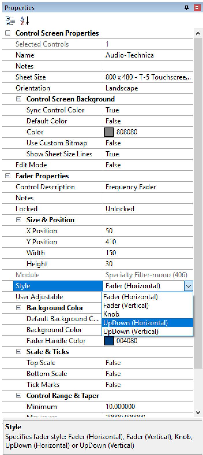
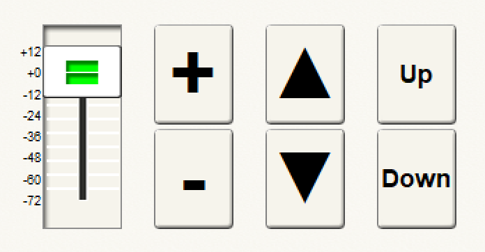
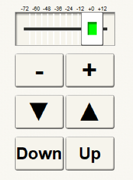
Sizing
Converting from non-UpDown style to UpDown style will not change the size of the control unless its maximum or minimum sizes are exceeded. Changing between the horizontal and vertical UpDown styles will swap the dimensions.
The size for a horizontal UpDown can range from 20x10 to 800x800. The size for a vertical UpDown can range from 10x20 to 800 x 800. The minimum size is determined by how small the background art can be aesthetically reduced.
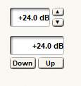
UpDown controls, like faders, are designed to work in conjunction with label controls. They may be used simultaneously with a fader style control on the same parameter. However, UpDown controls are much more valuable than faders in touch screens scenarios.
Horizontal and vertical UpDown styles are increment/decrement button pairs that modify the current value by the increment/decrement data programmed into the control by the module. This is the same data used by the keyboard up and down arrows.
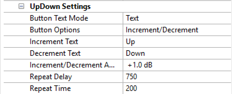
Button Text Mode
The UpDown buttons can be configured with four button text modes.
• Plus/Minus
• Up/Down Arrow
• Text
• Bitmap
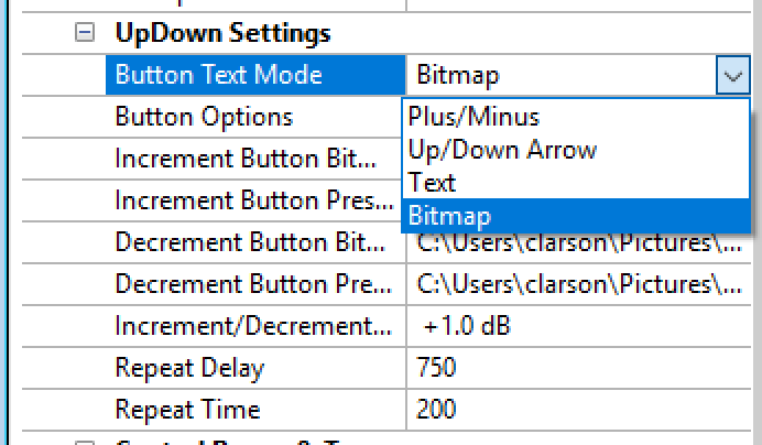
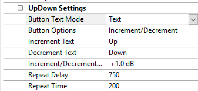
When text is configured, it can be set independently for each button from 0 to 255 characters.
Note: The font is fixed at Arial and cannot be changed. This is the standard default used by all controls. Symbols and custom symbols are not available for the UpDown at this time.
Colors
The default button background color matches the control screen background color if the control screen’s “sync control color” property is set to True. When set to False, any other color may be selected. They may also be set to transparent background and placed over custom graphics.
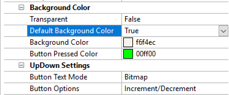
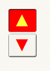
The UpDown buttons always act like momentary buttons. When pressed, the color is determined by the “Button Pressed Color” field.
The text is always black unless the control is selected, when selected the color is red. If the color algorithm determines that the button color conflicts with red text, the selection color becomes yellow.
Repeat Function
The repeat function is used to configure an UpDown button when it is pressed and held. The repeat function is always enabled. The Repeat Delay is the delay time before the first repeat is triggered and may be configured from 50 to 5000 milliseconds. Once the first repeat occurs, the Repeat Time is used to trigger the additional repeats and may be configured to happen every 50 to 5000 milliseconds, until the button in no longer pressed.
Control Range & Taper
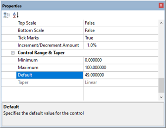
The maximum and minimum limits for the controls range can be programmed within the parameters of the specific fader type.
When multiple faders of different styles are selected, the relevant properties for all styles selected are shown, but will only modify those controls where it is relevant.
Default Values
All fader and numeric controls have a default value property (as of 8.5). For faders, this includes all forms including knobs and up/down controls. This is both the initial value for the control and the default value to return the control to. Fader and numeric controls can only take advantage the default value property if the user is allowed to modify the value.
The default value is set by Composer for each fader or numeric control instance in a module view. It will always be between the minimum and maximum display value as determined by the module.
The default value can be recalled by double-clicking on the control with the “CTRL” key held. It can also be recalled for all selected controls by clicking the “Return” key with the “CTRL” key held.
The default value property is only visible and editable for faders and numeric controls copied to a control screen and those in Intelligent Modules. It appears in the properties window for a selected control in the “Control Range & Taper” section.
When editing a default value in the properties window, it must be between the min and max display value for the control as determined by the module. For Intelligent Module faders, where the min and max display values are also editable, all three must be kept consistent when anyone changes. For other modules, the min and max display values are not always shown. The “Minimum” and “Maximum” values shown in the properties windows is initially the min and max value for the control but can be modified by the user for that instance in a control screen to limit the range of the control. For example, a frequency fader from an EQ may be limited to 15-20000 Hz, but when copied to a control screen may be limited for that instance to 100 – 1000 Hz, but the default value can be anywhere 15-20000 Hz.
Matrix and super-matrix modules have custom implementations of the feature. Matrix module controls copied to control screens can’t set a different default value as it would be the same for all gain adjusters in the control.
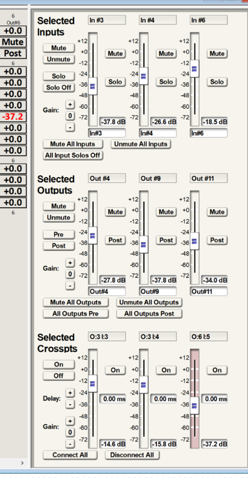
Super-matrix default activation is done through the selected panel with new zero buttons to zero the selected gains for input, output and grid matrix controls. The individual controls in the selected panel are set to default as any other fader or numeric or using the new zero group button. The only controls which can be copied to a control screen are individual controls and so the standard default implementation is used. Super-matrix delay controls do not have a default feature.
When exported to SymVue, the default value is included. In SymVue, the default value may be recalled using the same “Ctrl + double-click” action for, faders, knobs, spin, and numeric controls. To facilitate this, numeric controls no longer allow holding the control key down when double clicking it open the edit window or keyboard. Before it would work with or without the control key held. Similarly for spin controls, the control key may not be held when actuating the up and down buttons.
SymVue for Control Server and T-5/10 products are not affected since they do not have a double-click action. No alternate method of recalling the default is provided.