Button
Buttons are used to turn parameters on and off and start and stop actions.
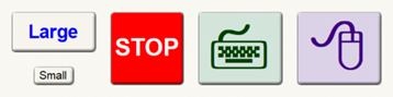
They have the following properties:
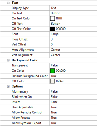
-
Text
-
Display Type - Specifies to use text or symbols to label the button. When choosing Symbols, a system font or custom set of images may be used.
-
On Text (only shown for Text Display Type) - Specifies the button text when button is on
-
On Text Color (only shown for Text Display Type) - Specifies the Text color when button is on
-
Off Text (only shown for Text Display Type) - Specifies the button text when button is off
-
Off Text Color (only shown for Text Display Type) - Specifies the Text color when button is off
-
Font (only shown for Text Display Type) - Specifies to use a predefined, automatic or custom font for the button text.
-
On Symbol (only shown for Symbol Display Type) - Select the Symbol to use when button is on
-
On Symbol Color (only shown for Symbol Display Type) - Select the Symbol Color to use when button is on.
-
Off Symbol (only shown for Symbol Display Type) - Select the Symbol to use when button is off
-
Off Symbol Color (only shown for Symbol Display Type) - Select the Symbol Color to use when button is off.
-
Horz Offset - Specifies the number of pixels to shift the text or symbol horizontally within the button. Negative numbers shift it left; positive numbers shift it right.
-
Vert Offset - Specifies the number of pixels to shift the text or symbol vertically within the button. Negative numbers shift it up; positive numbers shift it down.
-
Horz Alignment - Specifies how the text or symbol is horizontally aligned within the button: left, center or right. The alignment and offset work together; in most cases it is best to set the Alignment first, and then the Offset.
-
Vert Alignment- Specifies how the text or symbol is vertically aligned within the button: top, center or bottom. The alignment and offset work together; in most cases it is best to set the Alignment first, and then the Offset.
-
Background Color
-
Transparent - Specifies if the button background is transparent
-
On Color (only shown if Transparent is False) - Specifies the button background color when the button is on.
-
Default Background (only shown if Transparent is False) - Specifies if the button should have the same background color when the button is off as the Control View. When set to true, it automatically sets the Off Color property below it to the appropriate color. Alternately, this will be set to False if the Off Color property is manually changed.
-
Off Color (only shown if Transparent is False) - Specifies the button background color when the button is off. If the Default Background property is set to true, this will be automatically set to the color of the Control View. Changing this will then change the Default Background property to False.
-
Options
-
Momentary - Specifies if the button operates as momentary or latched.
-
Blink when On - Specifies if the button should blink when on.
-
Invert - Specifies if the button should show off state when on and on state when off.
-
User Adjustable - Specifies if the button’s state is user adjustable
When choosing between Momentary and Latching buttons, it almost makes sense to use Latching. This is generally the most effective way to interact with the script. See the NamedControl API extension for more information and examples.