Intelligent Module Control View Layout
Overview
When creating Intelligent Modules, controls can be added to the user interface of the Intelligent Module Control View. Not all Intelligent Module will need controls, but most will feature them. These controls will interact with the NamedControl API in the associated Lua script for the Intelligent Module. These controls are just like the user interface of any built-in module, except you get to create them when you make a new Intelligent Module. Controls can be added, moved, duplicated and their properties adjusted to create just the control layout that is needed. And when completed, just like any other built-in module, to make the Control View you design accessible to users outside of Composer, the controls must be copied to any Control Screen for use with SymView.
Control View
The Intelligent Module Control View Layout may be edited by double clicking on the Intelligent Module or right clicking on it and choosing “Open”. Initially a blank Control View will appear.
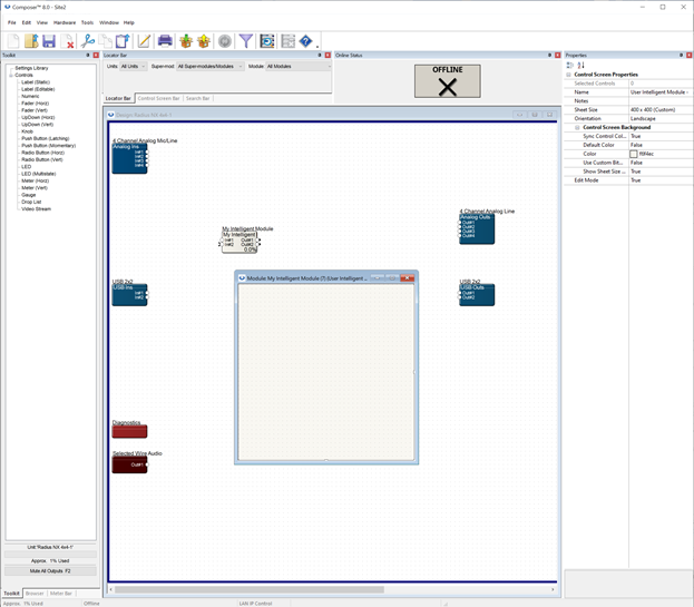
It has the following properties:
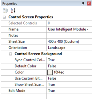
These are the same properties for Control Screens and are described in the corresponding section of the Help File.
Controls
Changes can be made to an Intelligent Module Control View by entering Control Layout Edit Mode accessible from the right click menu. Locked intelligent modules may not be placed in edit mode. (To learn more about locked Intelligent Module, see Creating Custom Intelligent Modules.
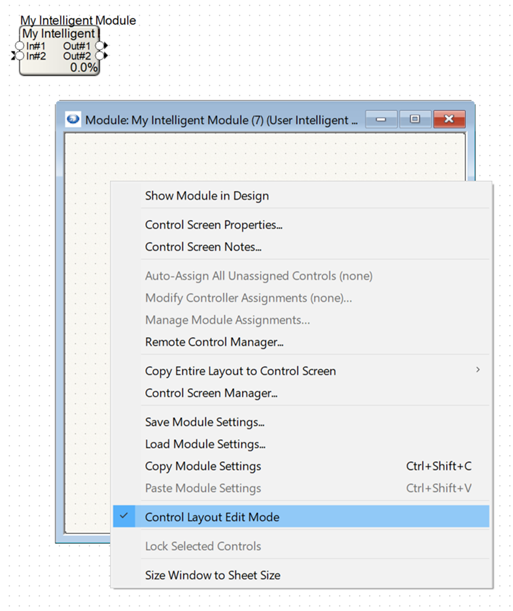
Once an Intelligent Module Control View is in Edit Mode, controls may be added to the view from the Toolkit. When an Intelligent Module Control View is shown, the Toolkit will show a custom set of controls that may be added to the layout.
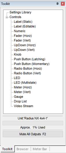
These controls may be dragged from the Toolkit into the layout.
The look, feel and functionality of the controls may be customized using the properties panel when a control is selected. The combination of the numerous controls and their flexible customization can be used to make virtually any custom layout you may need.
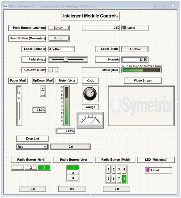
Many controls in the list are actually different versions of the same Control Type, just with different pre-configured properties. See the table below.
| Control | Control Type |
| Label (static) | Label |
| Label (editable) | Label |
| Numeric | Numeric |
| Fader (Horz) | Fader |
| Fader (Vert) | Fader |
| UpDown (Horz) | Fader |
| UpDown (Vert) | Fader |
| Knob | Fader |
| Push Button (Latching) | Button |
| Push Button (Momentary) | Button |
| Radio Button (Horz) | Radio Button |
| Radio Button (Vert) | Radio Button |
| LED | LED |
| LED (multistate) | Multi State LED |
| Meter (Horz) | Meter |
| Meter (Vert) | Meter |
| Gauge | Gauge |
| Drop List | Drop List |
| Video Stream | Video Stream |
Using these different preconfigured controls makes it easier and faster to build your Intelligent Module Control View.
Note that these controls are not the same as those that can be placed in Control Screens. For example, controls like text, picture, command buttons, and preset recall buttons are not available. The reason for this is that module views may only contain controls that are linked to a specific instance of a module. Those excluded controls exist apart from any specific module. This shouldn’t prevent a problem because Intelligent Modules view controls can be copied to Controls Screens where those excluded type of controls can be placed.
Additionally, while text controls can’t be placed, modules can use label controls to do the same thing with more flexibility because a label control can be static or editable. Similarly, while Picture controls cannot be placed, the Video stream can allow much of the same functionality. Both, along with the rest of the controls, will be described in detail below.
Any controls placed in an Intelligent Module Control View are tied to that Intelligent Module. If the instance of the Intelligent Module were to be deleted, any of the controls created and copied to control screens would be automatically removed. Again, this operation matches that of any other built in module.
Control Type Properties
Once a control is placed, its properties typically needs to be modified in order to be used by an Intelligent Module script. This is like editing controls in a Control Screen. The difference is that for some controls there may be some properties which have more flexibility than those of standard DSP modules.
The following pages will describe the various properties available for each custom Control Type, starting with common properties for all control types.
These additional properties will only be available if the user is authorized to edit the intelligent module. Locked intelligent modules or non-user library device modules will not show them. (again to learn more about locked Intelligent Module, see Creating Custom Intelligent Modules