Common
The following properties are available for all control types:
-
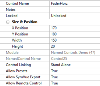
Control Name - This is a user assignable name for the control. It should be set to something unique, but this is not enforced. You will use this name along with the NamedControl API in your Lua script to get and set text and/or values for your control. As such the name should be something that is easily used by the Lua Script. That is, it should follow some type of naming convention making it easily recognizable in your script. For example, the image above uses the control type, followed by the control function, then followed by a number to derive the name “ButtonMute1”. (You can have spaces, but other areas of your code will not support spaces easily, so removing spaces in your Control Names may make your code more consistent.)
-
Notes - This allows you to add notes about the control. This can be used to explain more about its functionality.
-
Locked - This allows a control to be locked. When locked, it can no longer be moved and prevents any mouse clicks and keyboard presses from accidentally editing the control in anyway. It is particularly useful for controls that sit behind or above other controls.
-
Size and Position - This section shows the Size and Position of the control. Controls may be moved and resized directly in the interface by dragging it around the Control View or by dragging a resize handle. But these four controls allow precise numerical entry for the X Position, Y Position, Width and/or Height.
-
Module - Read only property showing the name of the Intelligent Module in which the control is used.
-
NamedControlName - Read only property showing an alternate internal name for the control. This is guaranteed to be unique for all controls in the Intelligent Module. At this time, it is only used by internal Composer functionality.
-
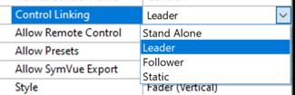
Control Linking - Often, you will want multiple controls to adjust and display the current state of the same control in different ways. For example, a Fader with a Numerical readout and UpDown steppers. Control linking allows this without having to write any code.
-
- Stand Alone - (Default) Stand Alone controls each are individually accessible by your script and presets.
-
Leader - Designates a control as the Leader to which you will assign one or more Followers. Leader/Follower functionality is described in more detail here.
-
Follower - Designates a control as a Followerl. You will then see an additional option to select a “Linked Leader Control” for it to follow.
 You must set a control as the Leader before you can set any controls as Followers. Leader/Follower functionality is described in more detail here.
 -
Static - Designates a control as Static which means it has no ability for script interaction. This is optional because simply leaving a control as Stand Alone but ignoring it in your script will have the same results. But setting a control as Static will reduce the CPU usage slightly (for more on CPU usage, see Creating Custom Intelligent Modules ). As such we recommend taking the time to set any controls as Static that won’t be used by your script, such as some labels.
-
Allow Remote Control - Specifies if the state can be remote controlled. This must be enabled if the script needs to Get and/or Set the control.
-
Allow Presets - (Shown for Buttons, Numeric, Up/down, knob. Radio button and drop list) - Specifies if the control can be assigned to a preset/
-
Allow SymVue Export - Specifies if the control can be exported to SymVue.
Custom Symbols
Custom Symbols can be used with either buttons or labels. As buttons they can be used to turn parameters on and off and start and stop actions. As labels they can be used to display text or symbols.
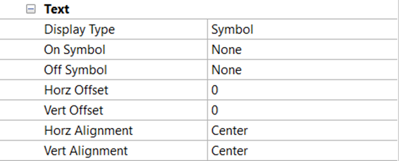
They have the following properties as buttons:
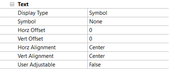
They have the following properties as labels:
-
Display Type - Specifies to use text or symbols to label the button. When choosing symbols, a system font or custom set of images may be used.
-
Symbol - (You can select two different symbols for On Symbol and Off Symbol when using the symbols as buttons) Allows you to edit and import the custom symbol.
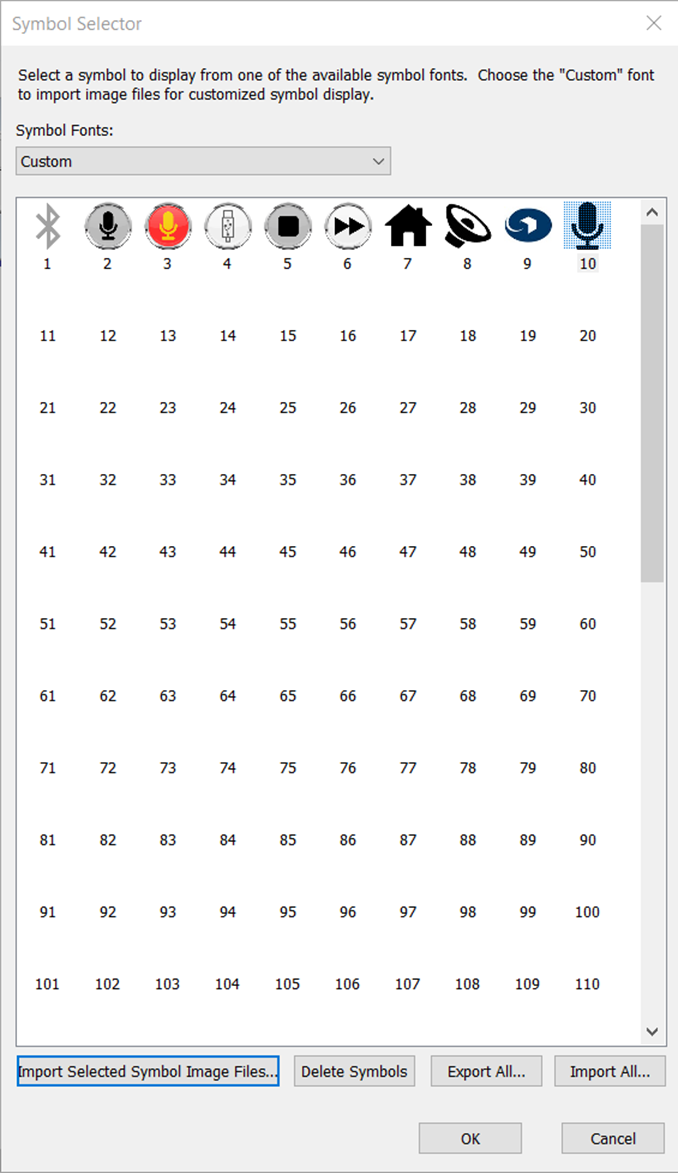
-
Horz Offset - Specifies the number of pixels to shift the text or symbol horizontally within the label. Negative numbers shift it left; positive numbers shift it right.
-
Vert Offset - Specifies the number of pixels to shift the text or symbol vertically within the label. Negative numbers shift it up; positive numbers shift it down
-
Horz Alignment - Specifies how the text or symbol is horizontally aligned within the label: left, center or right. The alignment and offset work together; in most cases it is best to set the Alignment first, and then the Offset.
-
Vert Alignment- Specifies how the text or symbol is vertically aligned within the label: top, center or bottom. The alignment and offset work together; in most cases it is best to set the Alignment first, and then the Offset.
-
User Adjustable (only available for “Label (User Adjustable)” controls) - Specifies if the label can be user adjustable.
Importing
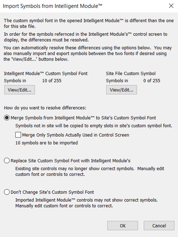
When importing an Intelligent Module containing custom symbols, you will be prompted with a window to manage the import of symbols from the Intelligent Module.
-
You can View/Edit the custom symbols associated with Intelligent Module you are importing. As well as View/Edit the custom symbols already in your site file.
-
Merge Symbols from Intelligent Module to Site’s Custom symbol Font - Allows you to combine the imported custom symbols with the existing symbols in your site file.
-
Merge Only Symbols Actually Used in Control Screen - option allows you to import the specific symbols used in the module you are importing. If left unchecked, it will import all the custom images from the site file that made the Intelligent Module.
-
Replace Site Custom Symbol Font with Intelligent Module’s - Removes your current custom symbol library and replaces it with the imported Intelligent Module’s library.
-
Don’t Change Site’s Custom Font - Will not import any custom symbols from the Intelligent Module.