Label
Labels can be used to display text or symbols. They can provide static titles to sections of a control layout, user editable to receive data or they can be used as readouts when controlled by the Lua script to display text dynamically.
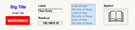
They have the following properties:
-
Text
-
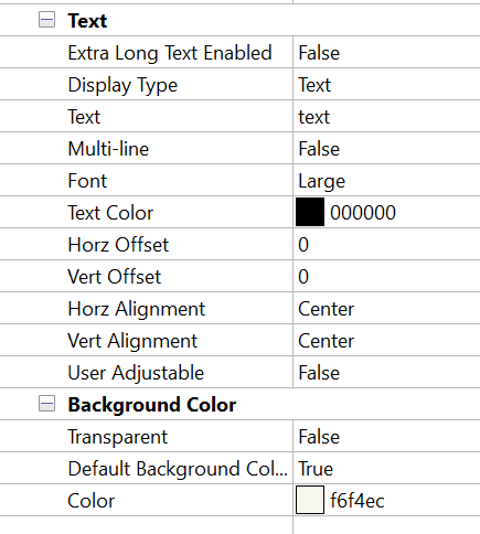
Extra Long Text Enabled - Specifies if the Intelligent Module processing can handle text longer than 256 characters (up to 4095) for this label. Only 8 labels with this feature enabled can be managed in a single DSP unit. If Extra long text is needed, set this to True.
-
Display Type - Specifies whether to use text or symbols for the label. When choosing Symbols, a system font or custom set of images may be used.
-
Text (only shown for Text Display Type) - Enter the text to display.
-
Multi-line (only shown for Text Display Type) - Specifies if the text should be drawn multi-line.
-
Multi-line Spacing (only shown when Multi-line is True) - Specifies the spacing for multi-line text: Single, 1.5 Lines or Double.
-
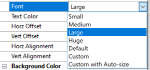
Font (only shown for Text Display Type) - Specifies to use a predefined, automatic or custom font for displayed text.
-
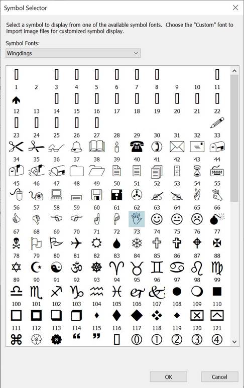
Symbol (only shown for symbol display type) - Select the Symbol to use.
-
Text Color - Specifies the text or symbol color
-
Horz Offset - Specifies the number of pixels to shift the text or symbol horizontally within the label. Negative numbers shift it left; positive numbers shift it right.
-
Vert Offset - Specifies the number of pixels to shift the text or symbol vertically within the label. Negative numbers shift it up; positive numbers shift it down.
-
Horz Alignment - Specifies how the text or symbol is horizontally aligned within the label: left, center or right. The alignment and offset work together; in most cases it is best to set the Alignment first, and then the Offset.
-
Vert Alignment- Specifies how the text or symbol is vertically aligned within the label: top, center or bottom. The alignment and offset work together; in most cases it is best to set the Alignment first, and then the Offset.
-
User Adjustable - Specifies if the label can be user adjustable. This must be set to "True" if the user or script needs to set the value of the control. This property may not be shown if Allow Remote Control is set to False, so it must be set to True before changing Allow Remote Control to True.
-
Background Color
-
Transparent - Specifies if the label background is transparent. This is often set True for titles, section headings and control labels. False is most often used when a label represents a data readout or entry field.
-
Default Background (only shown if Transparent is False) - Specifies if the label should have the same background color as the Control View. When set to true, it automatically sets the Color property below it to the appropriate color. Alternately, this will be set to False if the Color property is manually changed.
-
Color (only shown if Transparent is False) - Specifies the label background color. If the Default Background property is set to true, this will be automatically set to the color of the Control View. Changing this will then change the Default Background property to False.
If the script needs to set the value of the Label, first set "User Adjustable" to True, then set "Allow Remote Control" to True.